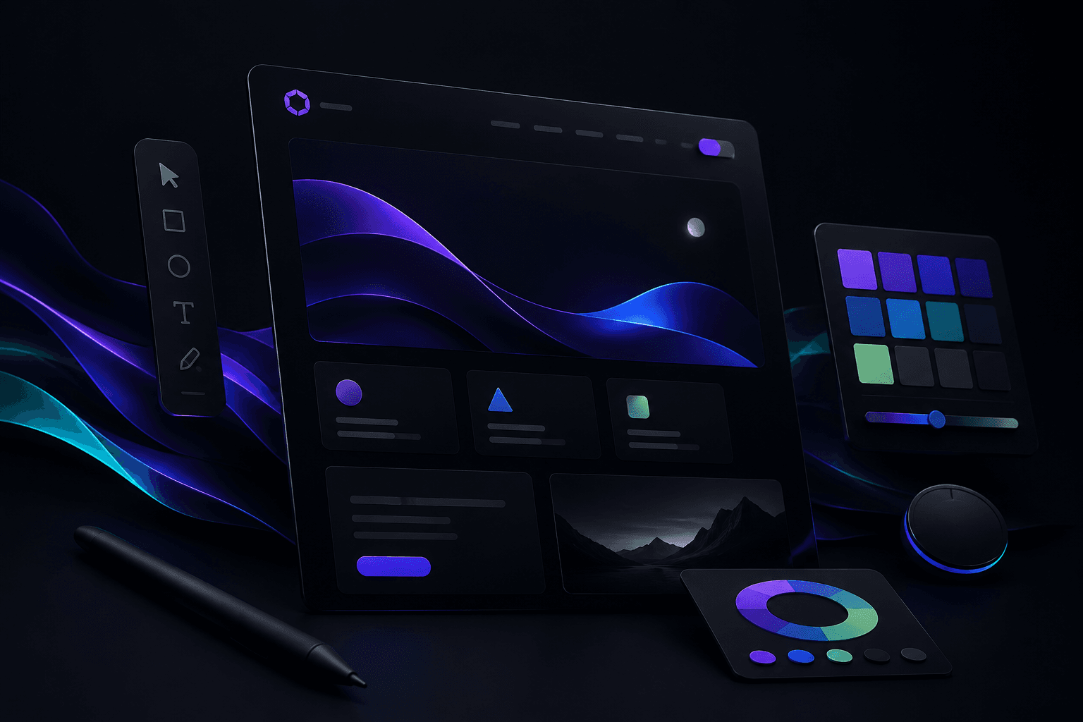
Great dark mode design feels effortless. Bad dark mode feels like someone flipped a switch and walked away. The difference comes down to intentional contrast, surface hierarchy, and knowing when not to use pure black.
Why dark mode is harder than it looks
Dark interfaces reduce eye strain and look premium, but they expose every weak decision in your palette. Colors that pop on white can vibrate uncomfortably against deep backgrounds. Shadows disappear. Borders need rethinking.
Dark mode is not a theme toggle—it is a separate design system that shares DNA with your light mode.
Start by defining surface layers instead of jumping straight to hex values:
| Layer | Purpose | Example |
|---|---|---|
| Base | Page background | #0d0d0d |
| Raised | Cards, panels | #141414 |
| Overlay | Modals, dropdowns | #1a1a1a |
| Border | Subtle separation | rgba(255,255,255,0.1) |
Building a surface hierarchy
Think in elevation, not flat backgrounds. Each layer should be slightly lighter or more saturated than the one below it. This creates depth without relying on shadows—which rarely work on dark UIs.
Text contrast tiers
Use at least three text opacity levels:
- Primary — headings and key content (
text-white) - Secondary — body copy (
text-white/70) - Tertiary — metadata, captions (
text-white/50)
Avoid #888 gray on #111 black. WCAG contrast ratios still apply in dark mode.
Color and accent discipline
Brand colors need adjusted saturation for dark backgrounds. A vivid purple that works on white may need to be slightly desaturated or brightened for dark surfaces.
:root {
  --accent: #a855f7;
  --accent-muted: rgba(168, 85, 247, 0.15);
  --surface-base: #0d0d0d;
  --surface-raised: rgba(255, 255, 255, 0.05);
}
Use accent colors sparingly—on buttons, links, and focus states. If everything is colorful, nothing stands out.
Images and media
Photos with white backgrounds look like stickers on dark UI. Consider:
- Adding subtle dark overlays on hero images
- Using PNGs with transparency where possible
- Applying a consistent color grade across photography
Testing and shipping
Before launch, test your dark mode in:
- A bright room (glare on screen)
- A dim room (true dark-mode use case)
- Multiple devices—OLED vs LCD behave differently
Ship dark mode as a first-class experience, not an afterthought. Your users—and your brand—will thank you.
Typography in dark environments
Font weight and size need adjustment in dark mode. Light text on dark backgrounds can appear thinner than the same weight on white. Consider bumping body text from 400 to 450–500 weight, or increasing size by 1px.
Line height and letter spacing
Generous line height (1.6–1.8) improves readability on dark surfaces. Slightly increased letter-spacing on small caps and labels prevents characters from visually merging.
Component-level patterns
Build reusable dark-mode tokens for buttons, inputs, cards, and navigation. Each component should reference surface layers—not hardcoded hex values—so theme changes propagate automatically.
Buttons and interactive states
Primary buttons need sufficient contrast against dark backgrounds. Hover states should lighten or add a subtle glow—not just shift hue. Disabled states must remain distinguishable without looking broken.
Accessibility considerations
Dark mode must meet the same WCAG standards as light mode. Test with screen readers, keyboard navigation, and high-contrast system preferences. Respect prefers-color-scheme and offer manual toggles when possible.
Focus indicators
Focus rings are easy to lose on dark UI. Use high-contrast outlines (2px solid with offset) in your accent color. Never remove focus styles for aesthetics.
Motion and transitions
Theme switching should feel smooth, not jarring. Use short cross-fades (150–250ms) when toggling between modes. Avoid animating large background areas—fade opacity instead.
Common pitfalls to avoid
Pure black (#000) backgrounds create harsh contrast and smearing on OLED displays. Over-saturated accents cause eye strain. Inconsistent surface layers make interfaces feel flat and confusing.
Quick checklist
- Surfaces use layered elevation, not flat black
- Text meets 4.5:1 contrast minimum
- Accents are desaturated for dark backgrounds
- Images are treated for dark context
- Focus states are visible and consistent
Book a Session
Ready to bring your brand to life? Schedule a free consultation and let's discuss your project.
Book NowFree 30-min discovery call
Comments
No comments yet. Be the first to share your thoughts.